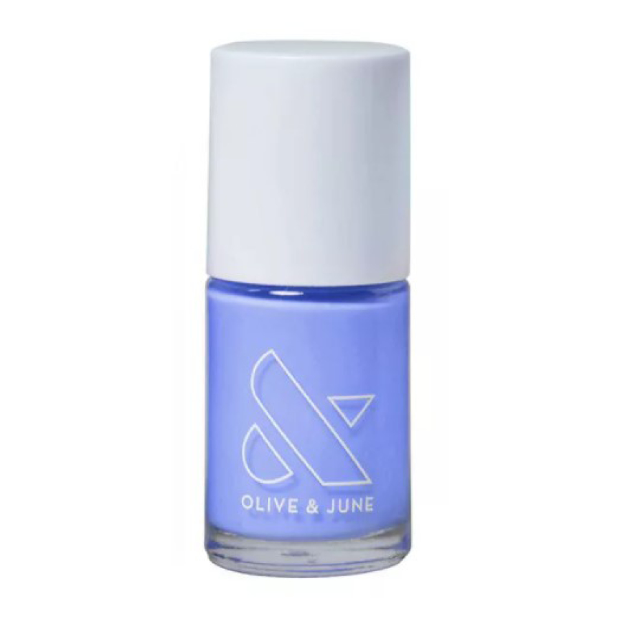
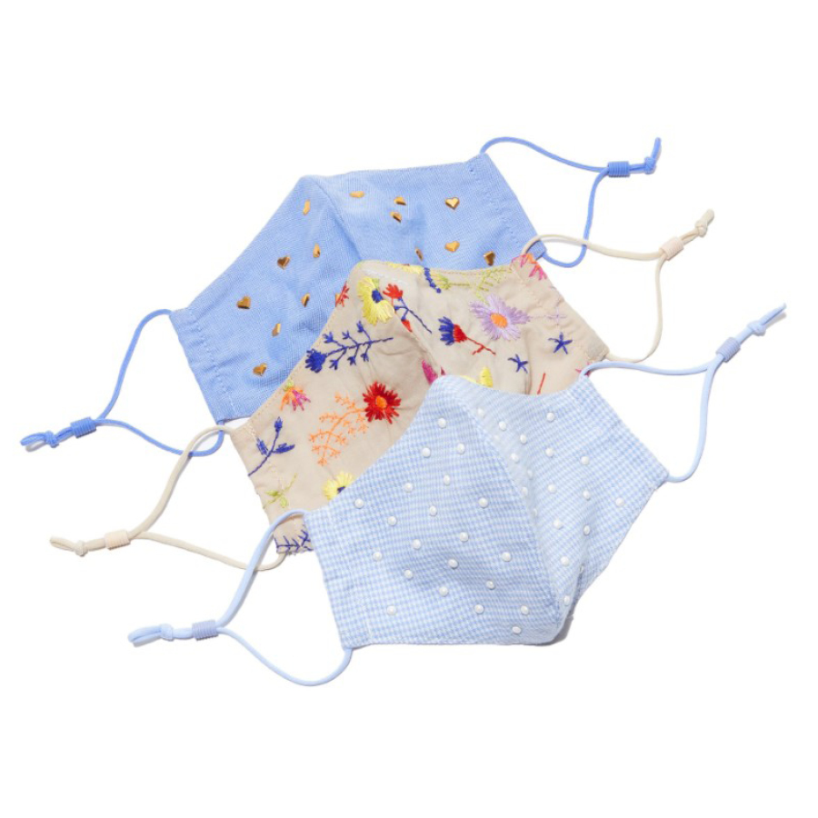
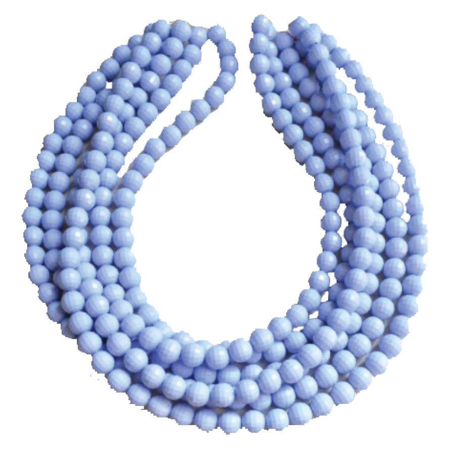
I’m always interested in what Pantone selects for their Color of the Year, and this year I was excited to see that they put a new spin on it! For the first time in the program’s 23-year history, they created a brand-new Pantone color for their annual pick: PANTONE 17-3938 Very Peri. Pantone’s Executive Director of the Color Institute says it best:
“As we move into a world of unprecedented change, the selection of PANTONE 17-3938 Very Peri brings a novel perspective and vision of the trusted and beloved blue color family, encompassing the qualities of the blues, yet at the same with its violet red undertone, PANTONE 17-3938 Veri Peri displays a spritely, joyous attitude and dynamic presence that encourages courageous creativity and imaginative expressions.”
– LEATRICE EISEMAN, EXECUTIVE DIRECTOR OF THE PANTONE COLOR INSTITUTE
Let’s see how we can incorporate this fun, expressive, unique color into agent listings! We’re putting our Virtual Paint skills to the test – check them out!
Exterior
Try a pop of Very Peri on the exterior to pull in hues from your flower beds.
BEFORE
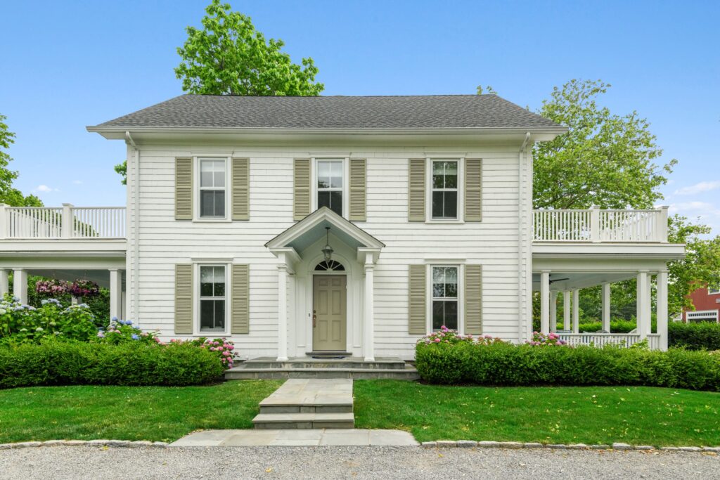
AFTER
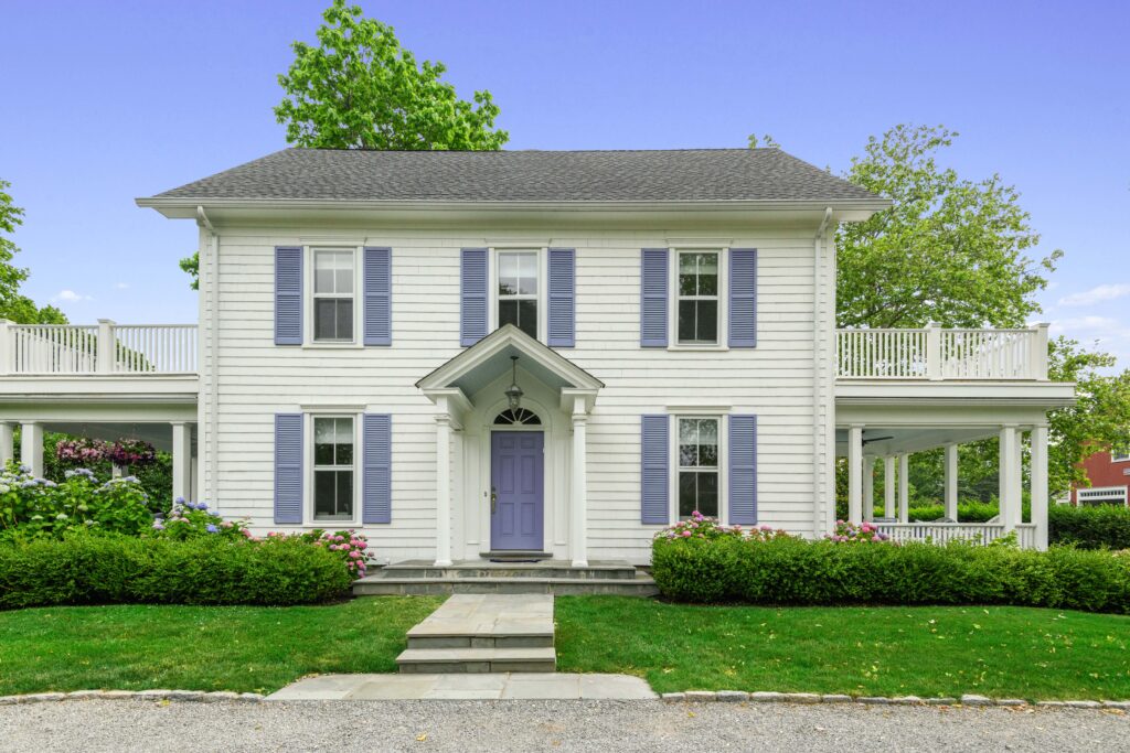
Photographer: JC C.
Interior
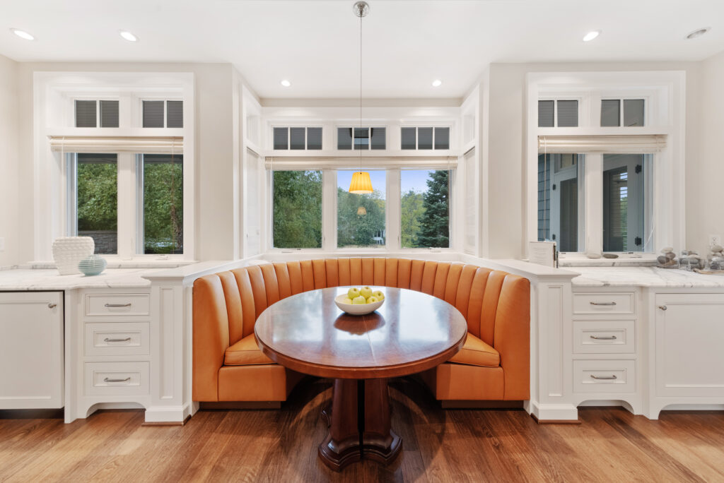
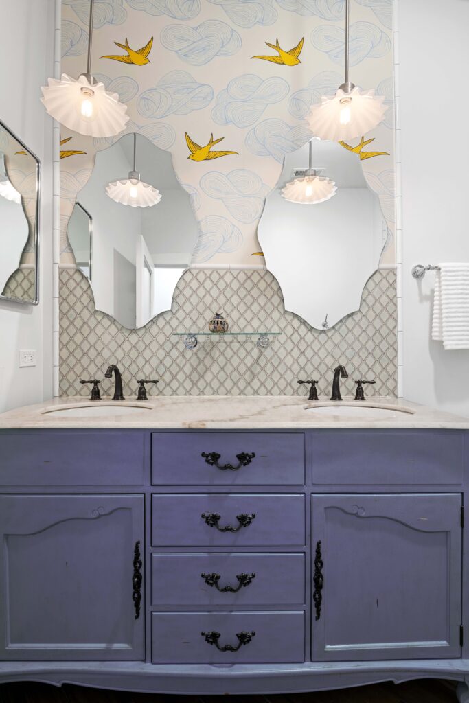
From kitchens to bathrooms and bedrooms, Very Peri adds an intriguing element of brightness and creativity wherever you find it.
BEFORE

AFTER

Photographer: Brent B.
BEFORE
AFTER
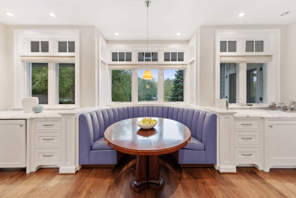
Photographer: Mark G.
BEFORE
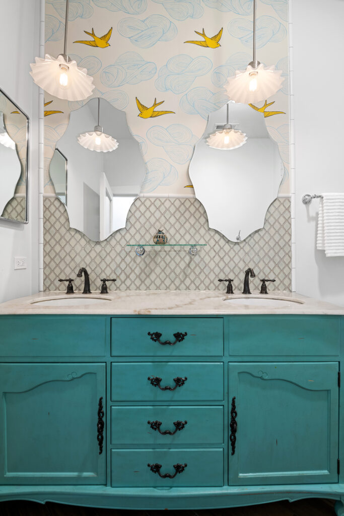
Photographer: Petr P.
AFTER
I personally can’t wait to rock Very Peri on my nails and in my wardrobe this spring! How will you pull in Very Peri to your world this year?

