In my role here at VHT Studios, it’s important to stay in touch with what’s happening in real estate, photography, and interior design overall. When there’s something I can pass on to our clients to help them make their listings standout, I’m all about it. So, when I was recently checking out what Pantone chose for the 2019 Color of the Year, I was excited to find such a vibrant explosion of color as their annual pick: PANTONE 16-1546 Living Coral.
Naturally, I couldn’t wait to do some testing with our Studio Team to see what effect this dynamic fusion of fun and nature could have on some of our clients’ listing photography. I got with my partners in the Studio to see how we could apply this funky yet mellow hue using our Virtual Staging Suite’s Virtual Paint. I found some beautiful photographs of rooms with more neutral tones and we took a shot at jazzing up the spaces with a splash of Living Coral.
Here’s how the rooms turned out.
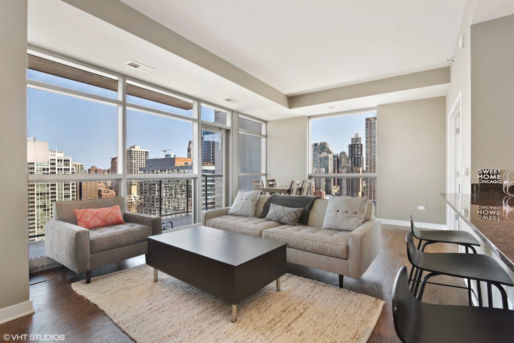
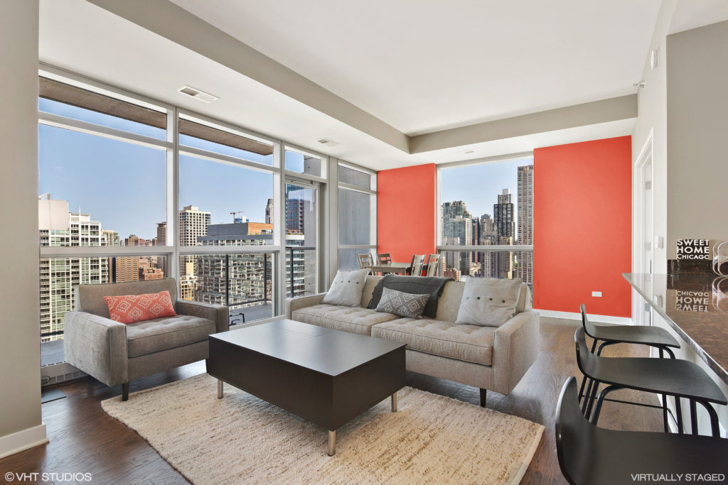
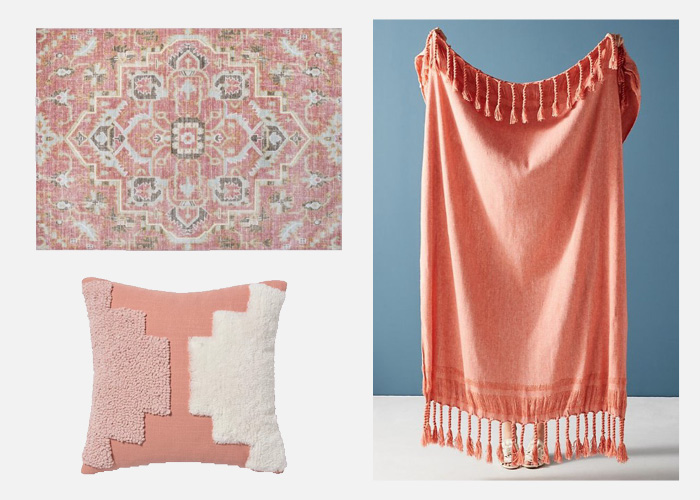
This high-rise condo has an amazing view, so we thought we’d lure the eyes back to the beautiful family room by hitting an accent wall with a little coral zing. For the ultimate statement, future owners could further transform this basic sofa with a trendy tufted pillow , a fringed throw, or a vintage-inspired rug.
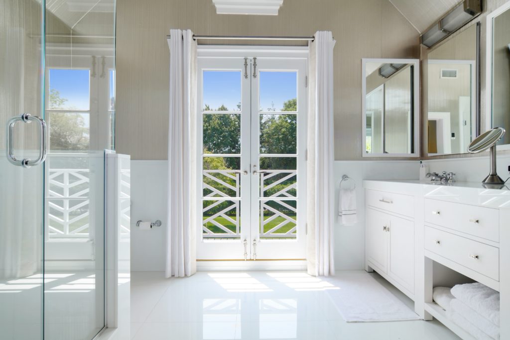
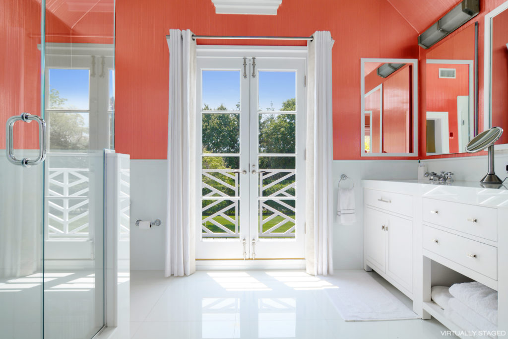
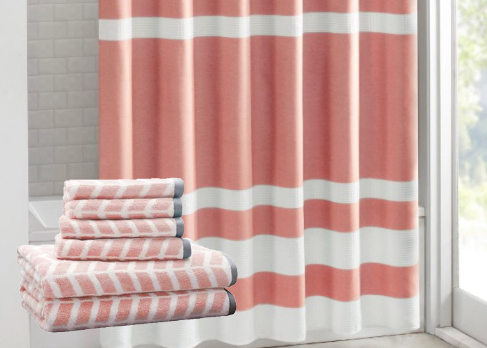
While this bathroom shouts squeaky clean and bright, we spiced it up to make it more playful and interesting. I could see taking it a step further with something from this patterned towel collection or perhaps a shower curtain turned into window panels to frame the gorgeous atrium doors.
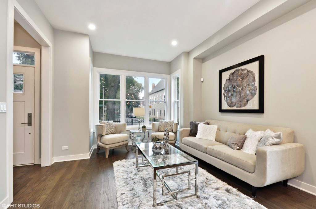
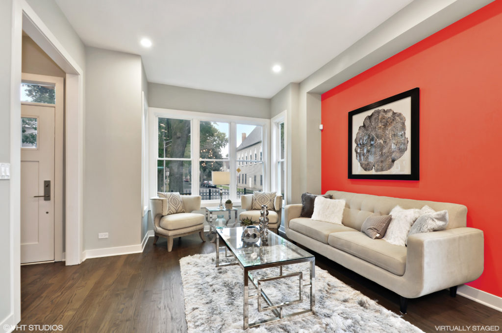
This space was crying for a little color to set it apart, so once again, we chose the primary wall to apply our Virtual Paint color, Living Coral. What a difference this made! Taking it to the next level, new owners could try applying a marbled mural or southwest-inspired wallpaper to make yet another lasting impression.
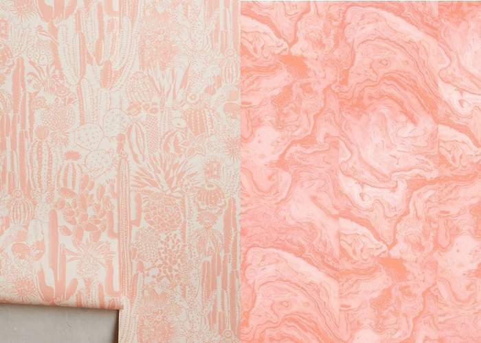
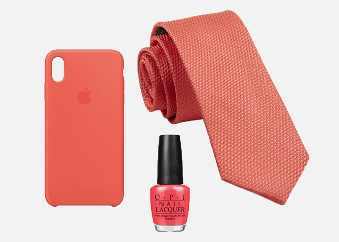
And for me personally, I’m taking Pantone’s Color of The Year and transcending Living Spaces. I plan on trying it on my nails and perhaps as my new phone case. I hope my husband likes how I’m working it into his 2019 wardrobe. It’s about time he moves into Coral Country, don’t you agree?

Van Teylingen Kathleen
January 24, 2019Reminds me of the Cheeto in the White House!
I love the splotches of accent do at the
January 24, 2019I love the splotches of accent do at the photos, but Bernie a core won’t wall or too many items the color of coral would be overwhelming. I am a social introvert and I feel most comfortable with neutral colors. Like I said a splash of adventure here in there is exciting but not to the point where it absorbs my attention.
Aubrey
January 29, 2019love this! great images and this color is beautiful!