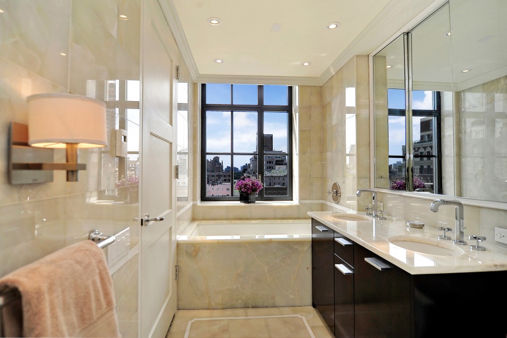
Today’s contemporary interiors are comfortable and welcoming without being cluttered and dark. A true contemporary home is designed and decorated with open space and natural light in mind. And because there isn’t any clutter, every piece has to count. Simplicity, neutral colors, subtle sophistication, smooth textures, and clean lines help to define contemporary style. But of course, there is always room for a little rule breaking.
Park Avenue in New York City is the perfect place for a contemporary home tour, don’t you think?
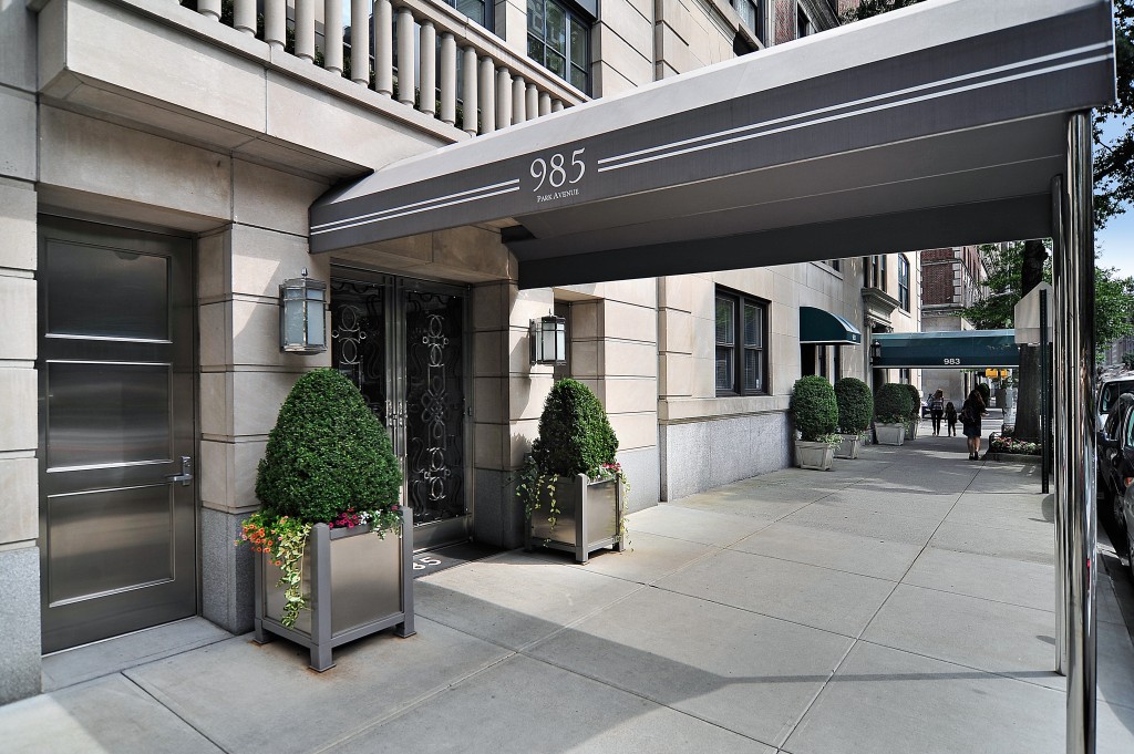 First the front view. Now let’s journey up to the penthouse.
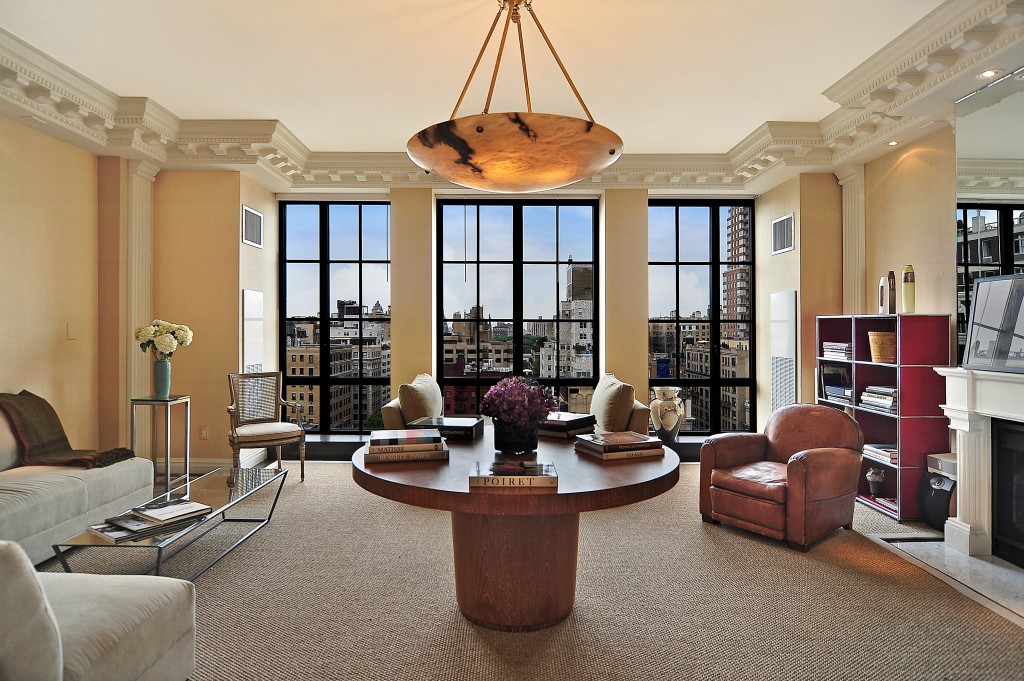 This living room stays true to simple geometric forms: squares, rectangles, and circles. And, as a bonus, it is very balanced and symmetrical. My sense of proportion is very satisfied. I usually only say that about a big meal being placed in front of me when I’m very hungry, but I think it applies here as well.
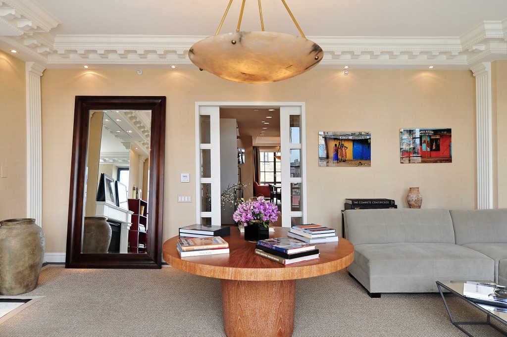 Here is the living room from a different angle. The monochromatic brown/tan color scheme is on full display here, providing a backdrop for bold colored accessories (flowers, artwork, etc.)
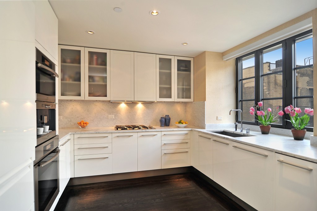 Clean, crisp and white, with just a punch of color added from the tulips. Contemporary rooms are nothing if not polished, and that means these high-gloss surfaces fit right in.
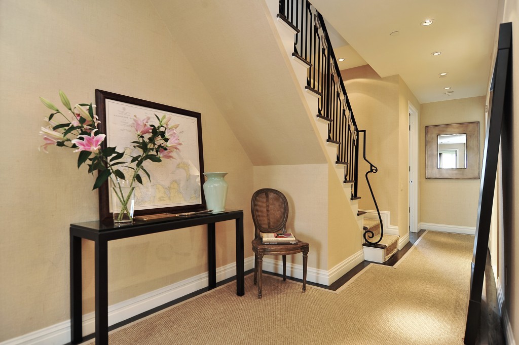 In a contemporary style interior, don’t use ruffles, excessive details, fringe, or floral prints. Abolish cute and small. Go basic, bold, and structural. This chair, side table and accessories are just right.
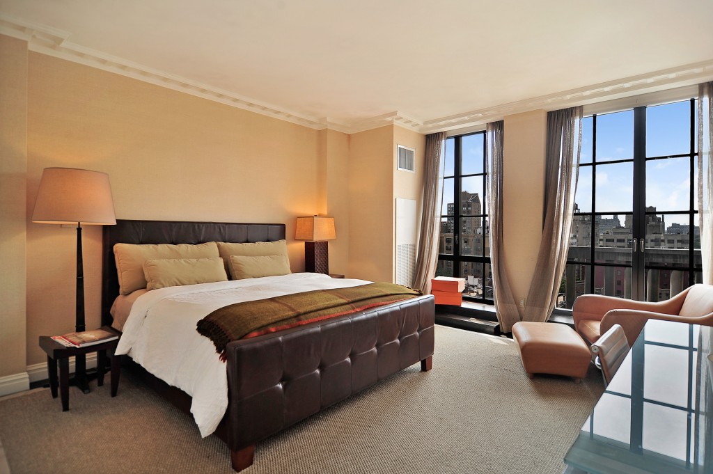 Contemporary furnishings are simple, uncluttered, and have clean lines. Sofas, chairs, and ottomans typically have exposed legs. Beds usually have no skirt, trim, fringe, or tassels, as seen here in the master bedroom.
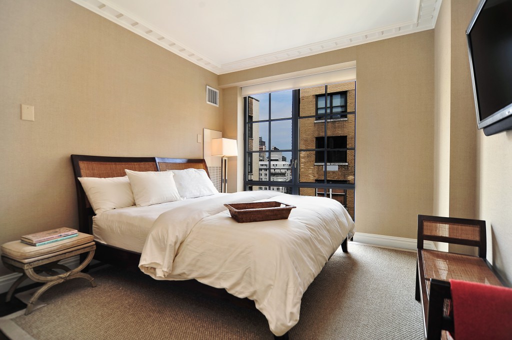 More of the same in the second bedroom, only in white. Note the exposed legs on all the furniture.
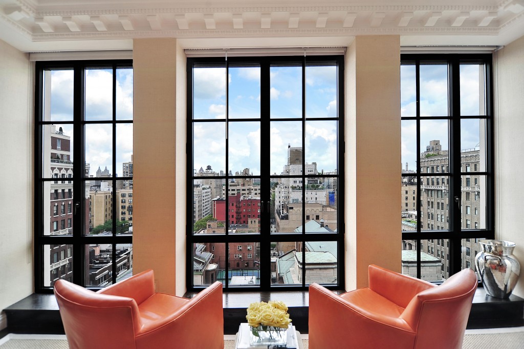 Let’s talk windows when you’re going for a contemporary look. Typically, windows should be large, unadorned, and left to speak for themselves. Can you picture tasseled draperies or a full valances in this space? Neither can I.
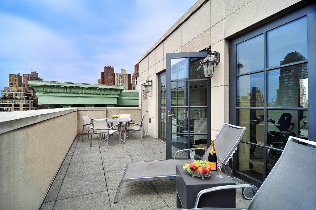 And finally, we end on the terrace. More clean lines and streamlined tables and chairs. And what’s this? Champagne for me?
To see the full tour, click here!

