Some listing photos are so bad they need no introduction. These are those photos. So, without further ado:
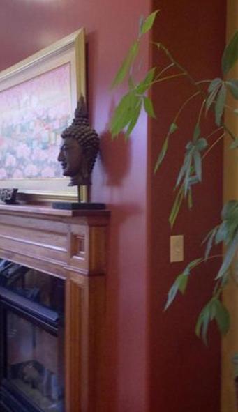 What is the selling point here? There is a lot going on in this photograph without anything going on in this photograph. Note to sellers, your favorite place in the house might be standing in a spot where you can gaze at your Terra Cotta Warrior bust while a plant partly obscures your view. That’s fine, but it’s probably not important to prospective buyers. Take a step or ten back and show them the whole room.
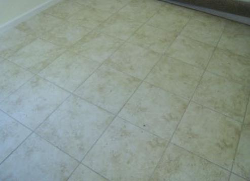 This photo just screams make yourself at home. So inviting! I can totally see myself…standing here?
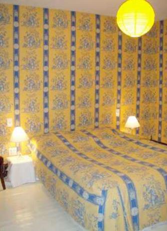 What is the purpose of matching ones wallpaper to ones bedspread? Perhaps this seller was trying to create the illusion of space. The illusion of a space you never want to enter. This idea would have worked flawlessly had the stripes on the wall been lined up perfectly with the stripes on the bed. It’s called attention to detail, people. The thing I don’t understand is why no one sprung for the matching floor, lamps, and nightstands.
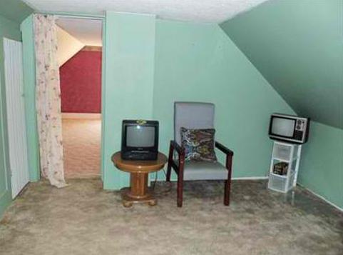 Staging at its finest right here folks. Someone call up HGTV and get this house on an episode of Design to Sell ASAP. If this room is any indication, the entire house is in dire need of a makeover.
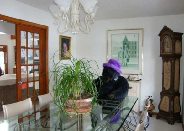 If anyone ever needed a good reason to fire their real estate agent this is it. Nothing says “Professionally Marketed by…” more than a huge stuffed gorilla in a fuzzy purple hat. That is a gorilla, right? And it is stuffed, right?! The more I look at it the less I know. This photo alone might be grounds to cross this house off of the list.
