There is something to be said for symmetry and matching furnishings in a space. However, I think rooms with the most character have the least uniformity.
Sure, it can be intimidating to work with multiple textile patterns, but in doing so you can create a much more interesting space. Mixing and matching your choice of patterns and colors creates a custom look, even when the fabrics used are not. You’ll have way more flexibility in your decor style this way, just remember that careful coordination and some balance is key.
This home is perfectly unpredictable.
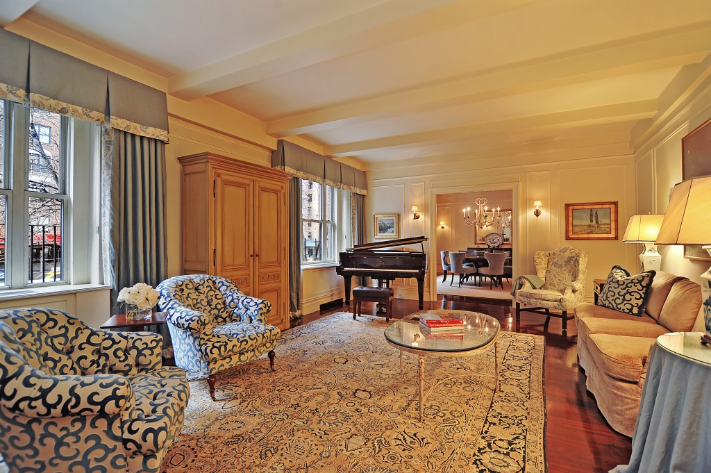 This works because the patterns are all in the same color family and of different scale. If you were to use the same sized patterns throughout a room, it would look way too busy. In this picture, the large print on the chairs contrasts well with the pattern on the area rug.
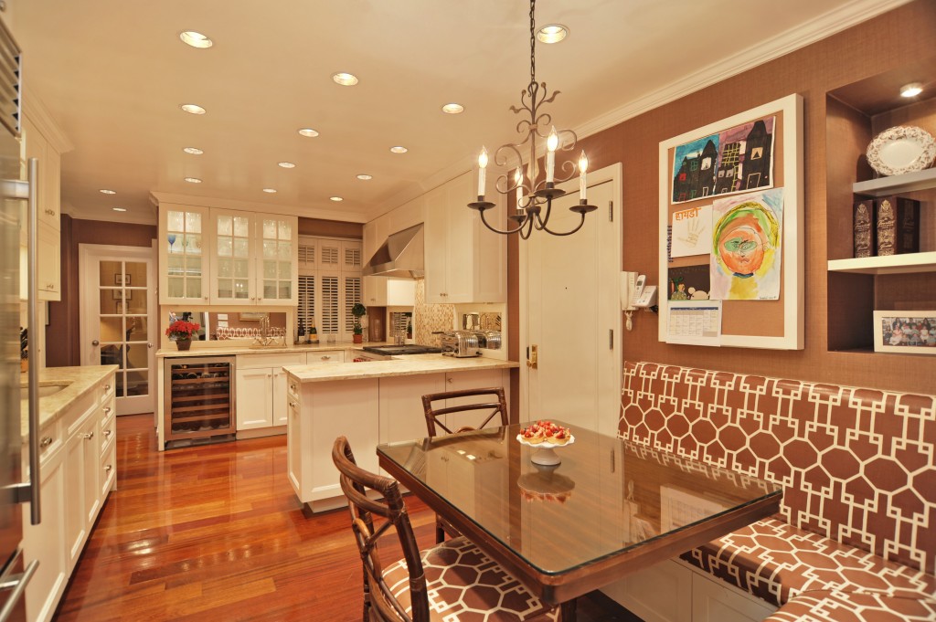 Great pattern on the fabric of the chairs and bench in the breakfast nook…
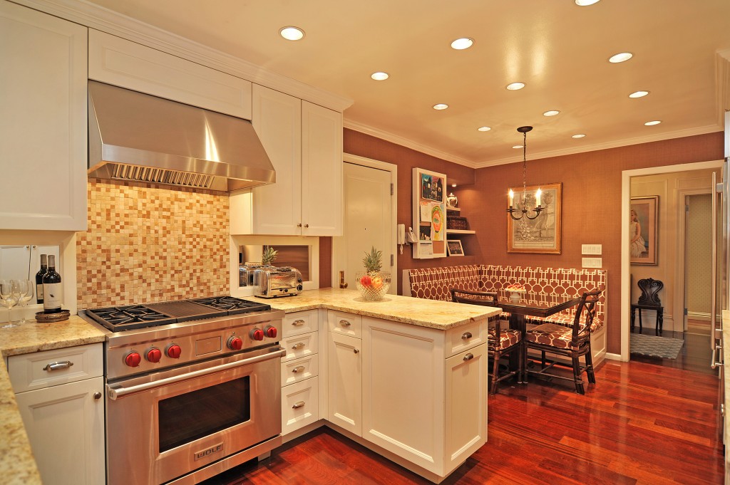 And it goes great with the backsplash in the kitchen!
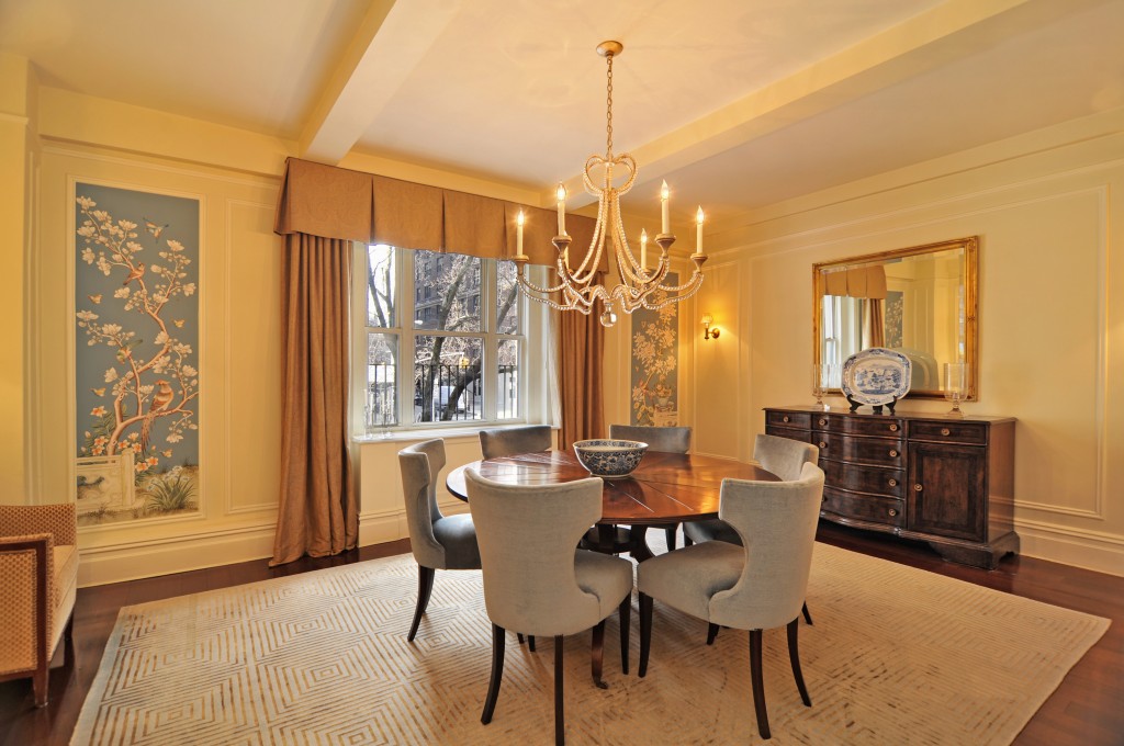 What keeps this dining room balanced is symmetry, plain and simple.
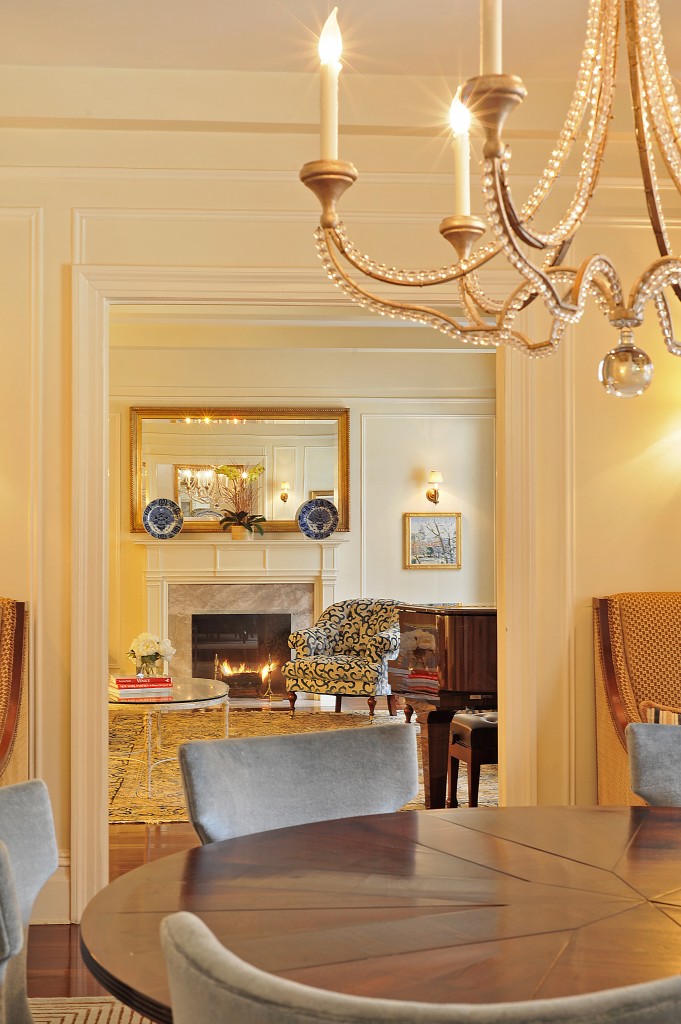 This is just a beautiful picture. And the mismatched lounge chairs work very well because the chairs are of the same size. Sameness in scale is important when using unlike furniture pieces in close proximity.
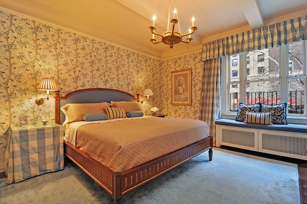 Rotate patterns to create cohesion when mixing and matching. Use one on the bed spread, one on the curtains, another on the wall, one on the pillows up front, and another on the back pillows, etc.
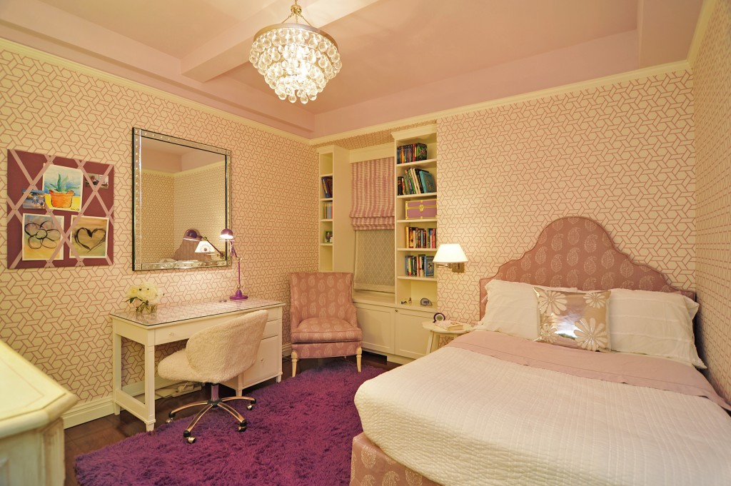 This second bedroom probably took a lot of time, coordination, and shopping to pull off. And it paid off. This is how you mix in patterns through color continuity.
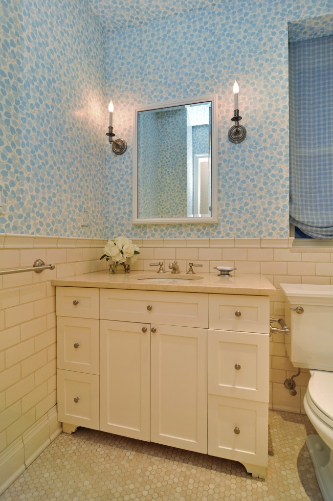 You didn’t doubt that there would be a bold, mix-and-match patterns in the bathroom, did you?
This house was shot by VHT Photographer Elizabeth Dooley for Sotheby’s International Realty. To see the full tour, click here.
